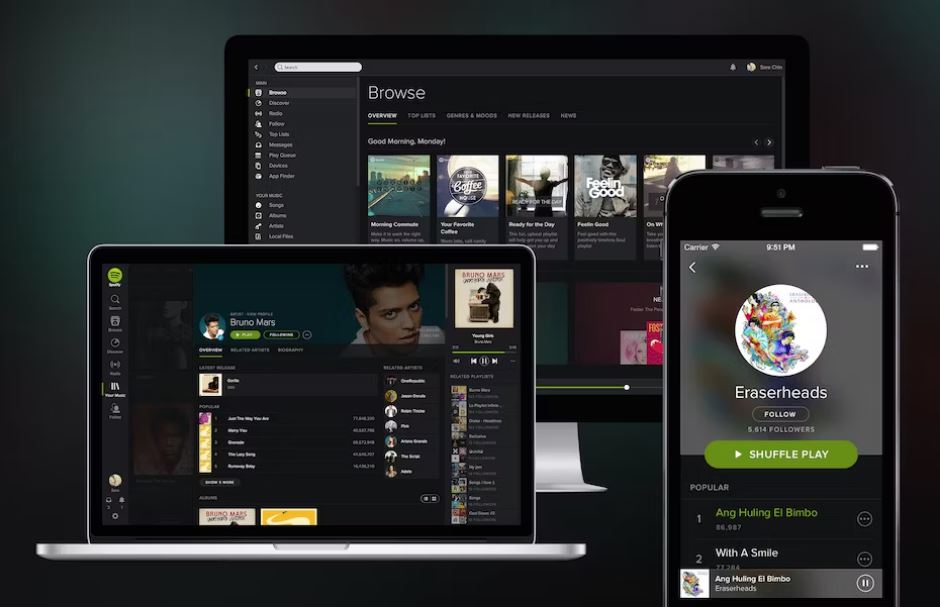
Embarking on the journey of digital design brings forth a captivating dance between the mobile and desktop worlds. As the realms of mobile applications and desktop software continue to evolve, designers find themselves at the crossroads of innovation, faced with distinct challenges and opportunities.
In this blog post, we’ll unravel the intricate tapestry of design principles that delineate these two universes. From the nuances of touch-centric interactions on mobile devices to the expansive landscapes of desktop interfaces, we’ll explore how the essence of design shifts to meet the unique demands of each platform.
Join me on this exploration as we delve into the constraints and freedoms that come with limited screen real estate, diverse input methods, and the ever-evolving expectations of users. Whether you’re a seasoned designer navigating the intricacies of both worlds or a newcomer eager to understand the distinctions, this journey promises insights into crafting user experiences that resonate seamlessly in the mobile and desktop domains.
Let’s dive into the fascinating world where pixels meet purpose, where gestures and clicks converge, and where design principles sculpt the user’s digital voyage. Welcome to the crossroads of Mobile Apps and Desktop Software Design!
Mobile vs. Desktop Design – Here’s a concise listing comparing design principles for mobile apps and desktop software:
Screen Size
- Mobile Apps: Limited screen space, focus on simplicity
- Desktop Software: Larger screen space, more room for features
Touch vs. Mouse Input
- Mobile Apps: Designed for touch gestures
- Desktop Software: Designed for mouse and keyboard interaction
Navigation
- Mobile Apps: Emphasises hierarchical and flat structures
- Desktop Software: Often uses menus, toolbars, and ribbons
Interactivity
- Mobile Apps: Gestures, swipes, and taps
- Desktop Software: Clicks, drags, right-clicks, and keyboard
Responsive Design
- Mobile Apps: Adapts to various screen sizes
- Desktop Software: May have a fixed layout or resizable windows
Orientation
- Mobile Apps: Supports portrait and landscape modes
- Desktop Software: Typically used in landscape or portrait
Contextual Actions
- Mobile Apps: Context-sensitive menus and gestures
- Desktop Software: Context menus and keyboard shortcuts
Information Density
- Mobile Apps: Focus on key information due to limited space
- Desktop Software: Can display more information at once
Consistency
- Mobile Apps: Consistent UI patterns across platforms
- Desktop Software: Consistency within the desktop environment
Platform Guidelines
- Mobile Apps: Adheres to iOS Human Interface Guidelines or Android Material Design
- Desktop Software: Adheres to specific platform design guidelines (e.g., Windows, macOS)
Notifications
- Mobile Apps: Utilises push notifications and banners
- Desktop Software: May use system notifications or in-app alerts
Offline Functionality
- Mobile Apps: Prioritises offline functionality
- Desktop Software: Often assumes a consistent internet connection
Resource Usage
- Mobile Apps: Optimised for lower processing power and memory
- Desktop Software: May require higher processing power and memory
Keep in mind that these are generalisations, and there can be variations based on specific app or software requirements and user expectations. Design principles should always be adapted to the specific needs of the project and its target audience.
Regards, Guy Fagan
Digital Consultant
+353 87 220 6067 – guy@guyfagan.com – www.guyfagan.com
